Reining in a global safety program for brand alignment.
Role: Art Direction, Brand Design
Background
In 2018, I partnered with owners of a new pilot program to create an identity and basic brand kit. Thus marks the beginning of the WorkingWell program, and it grew rapidly. By 2022, the pilot had expanded from one site in one city to 2,000 locations worldwide.
The Challenge
The original brand kit consisted of basic templates for brochures and posters, videos, a logomark, a palette, as well as some basic design guidance. All materials were created for a US English-speaking audience, and as program expansion accelerated, stakeholders around the world modified and localized materials to keep up with the pace of expansion.
Approximately 20,000 materials were created without oversight and were therefore never reviewed for accuracy or quality. The program’s purpose and image became muddied, and a new mechanism was needed to both refresh the program and enable managers to move quickly. Ideally, the mechanism would remove the need for a manager to modify the materials or manage localization.
The Approach
Success hinged on cleaning up sub-standard materials and defining the program better. To do this, I lead a group of program representatives through a brand audit and branding exercises. We started by conducting the brand audit. During the audit we identified what materials existed and where. This gave us insights into why stakeholders were creating materials, and what kind of problems they were looking to solve. This information gave us a good foundation to begin branding exercises. We used findings from the audit to create a vision statement, define the program’s customers, explain why the program existed, its tone of voice, and what qualified something as part of the program. Then, obtained approval from program owners to move forward.
With these elements in place, we could now approach the visual design objectively and refresh the materials to align better with the company, how stakeholders actually used them, and how program owners envisioned.
Results
Before the brand audit, the program was misaligned to company standards. Capturing the brand essence on paper allowed us to revise visual design and bring it into alignment. We selected company brand-aligned colors and developed communications templates with tools everyone had access to. Instead of self-translating or modifying materials with found tools, a subject matter expert anywhere in the world can now follow a simple step-by-step guide to deploy brand aligned and quality controlled communications specific to their region.
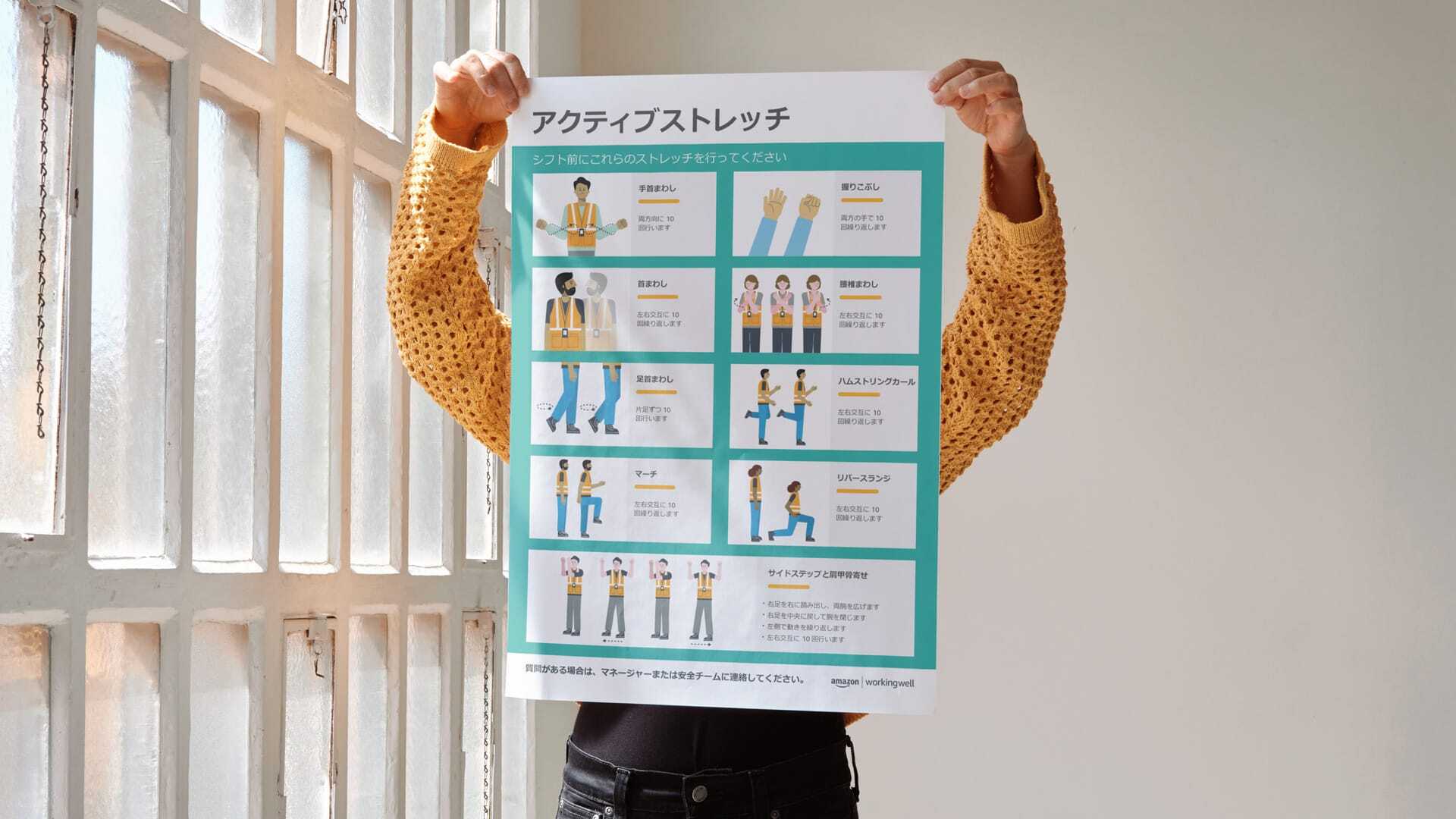
We also developed a mechanism to mitigate the need for managers to modify materials: tool kits. We created a collection of topic-based materials based on patterns we found during the brand audit, then worked with localization experts to translate everything so program stakeholders didn’t need to. The approach approved successful. As new tool kits were launched, older materials were phased out, and stakeholders and program owners continue to partner together for successful toolkit deployments every day.
Visual Identity
The original mark was loved by program owners and beneficiaries of the program, but it predated company guidelines and was phased out. The mark was preserved in an icon library as a form of tribute.

The updated mark looks like this:
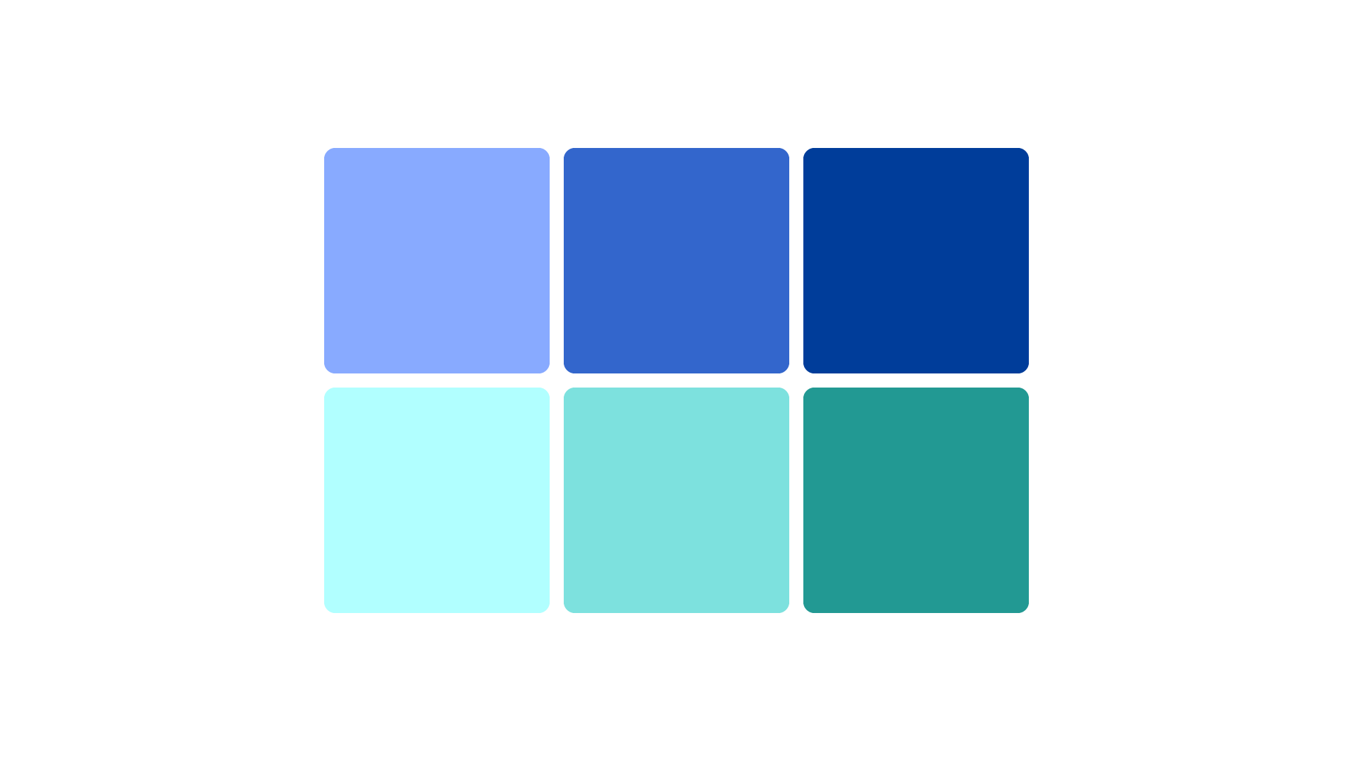
The program originally leaned on highly energetic colors. Developing the brand framework revealed the need for a calmer palette, but one that could be louder or quieter when needed:
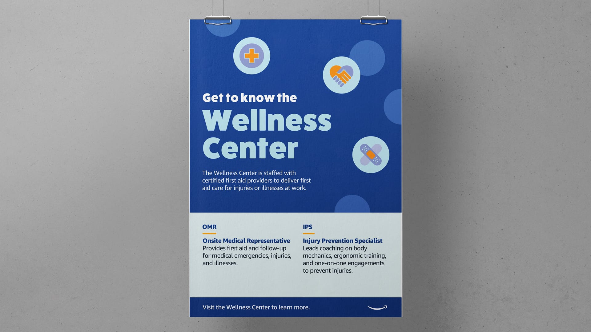
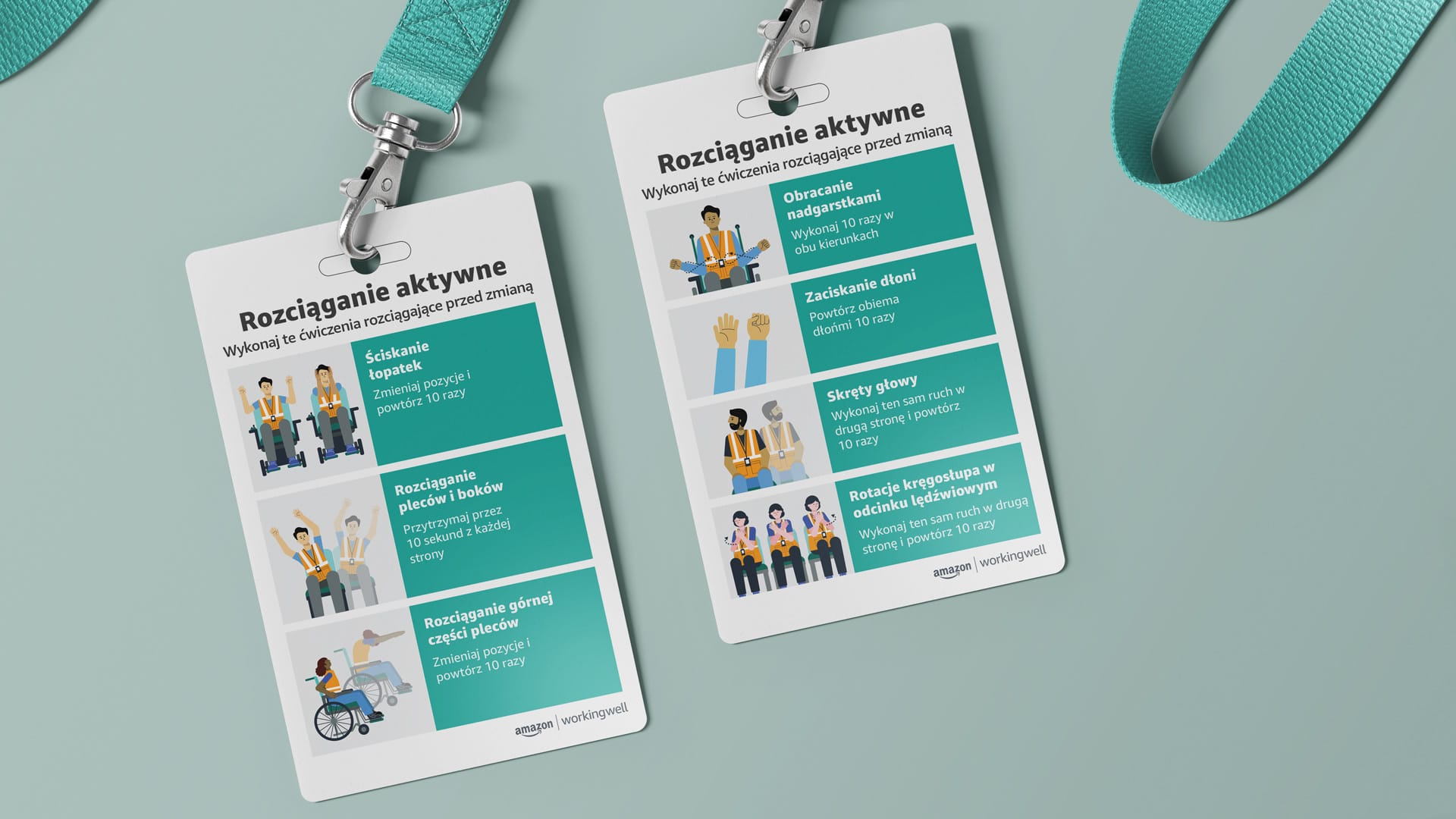
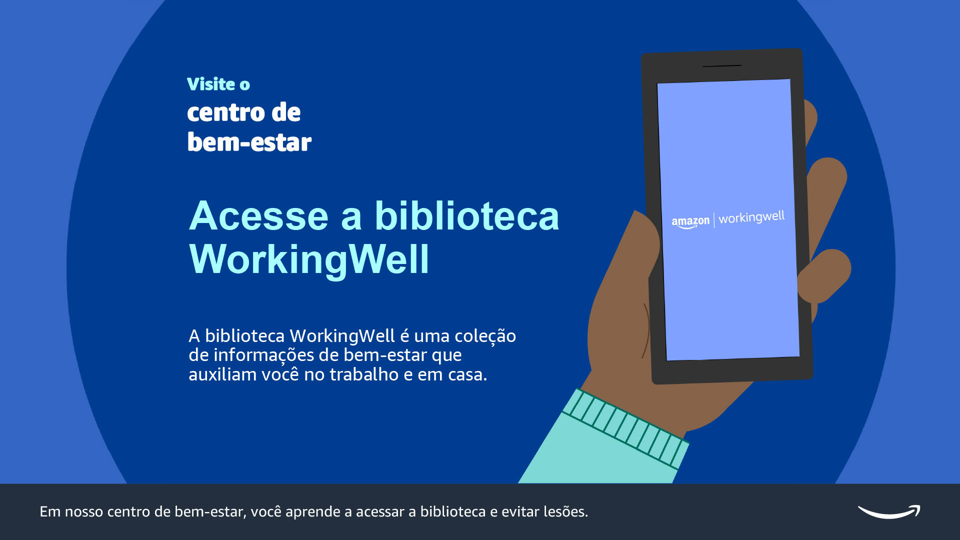
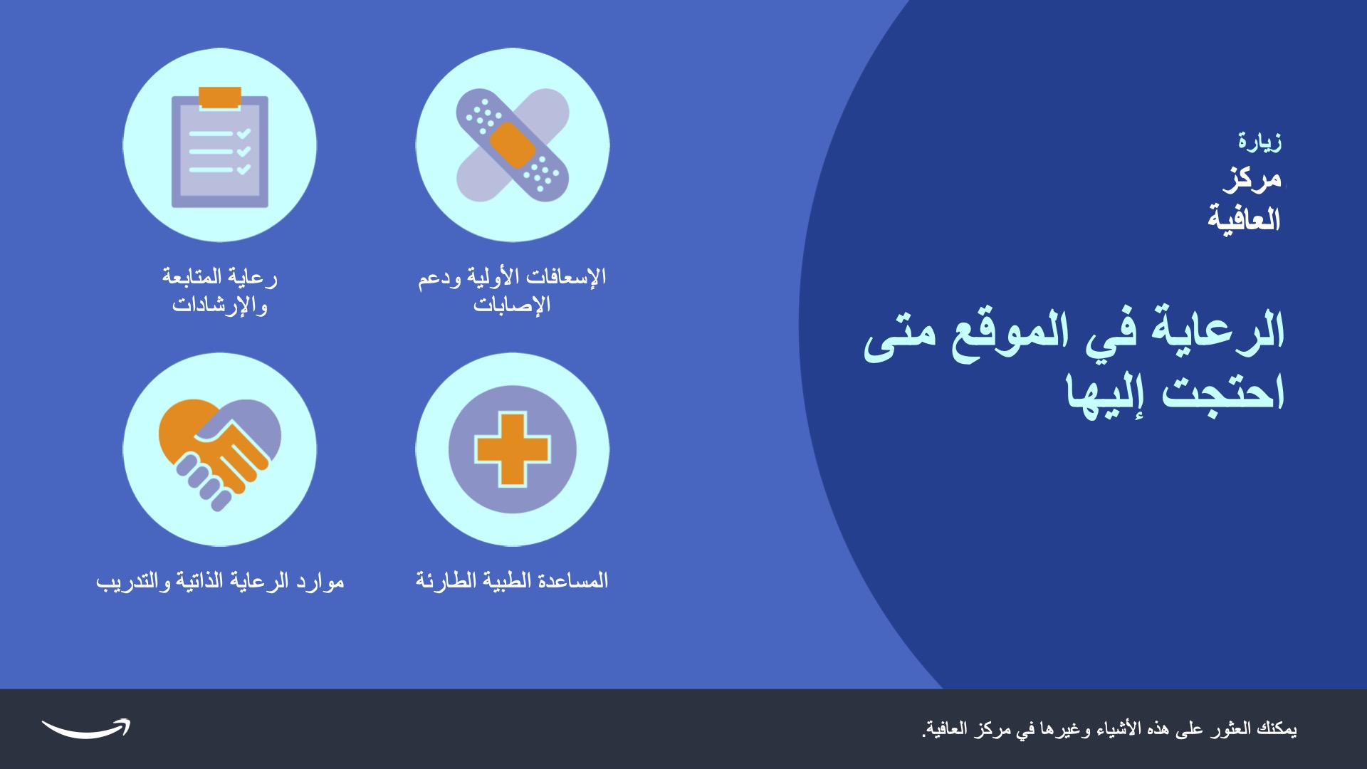
Examples of tool kit materials: