A 20,000 Material Rebrand
Role: Art Director, Brand Designer, Project Manager
Overview
I led a rebrand of a global program with over 20,000 existing materials. This project pushed me beyond my expertise in visual design, and into brand definition, governance, and creating scalable systems to ensure quality in situations where a professional designer isn’t available.
Approach
Discovery
Before work could begin, I needed to align program owners and stakeholders around the program’s vision, customers, and scope. These conversations directly shaped the position, messaging, and visual expression of the rebrand.
Visual Design
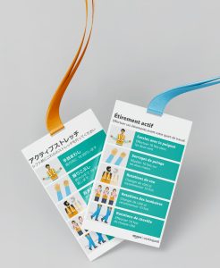
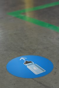
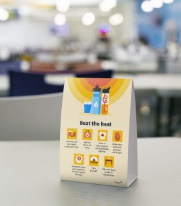
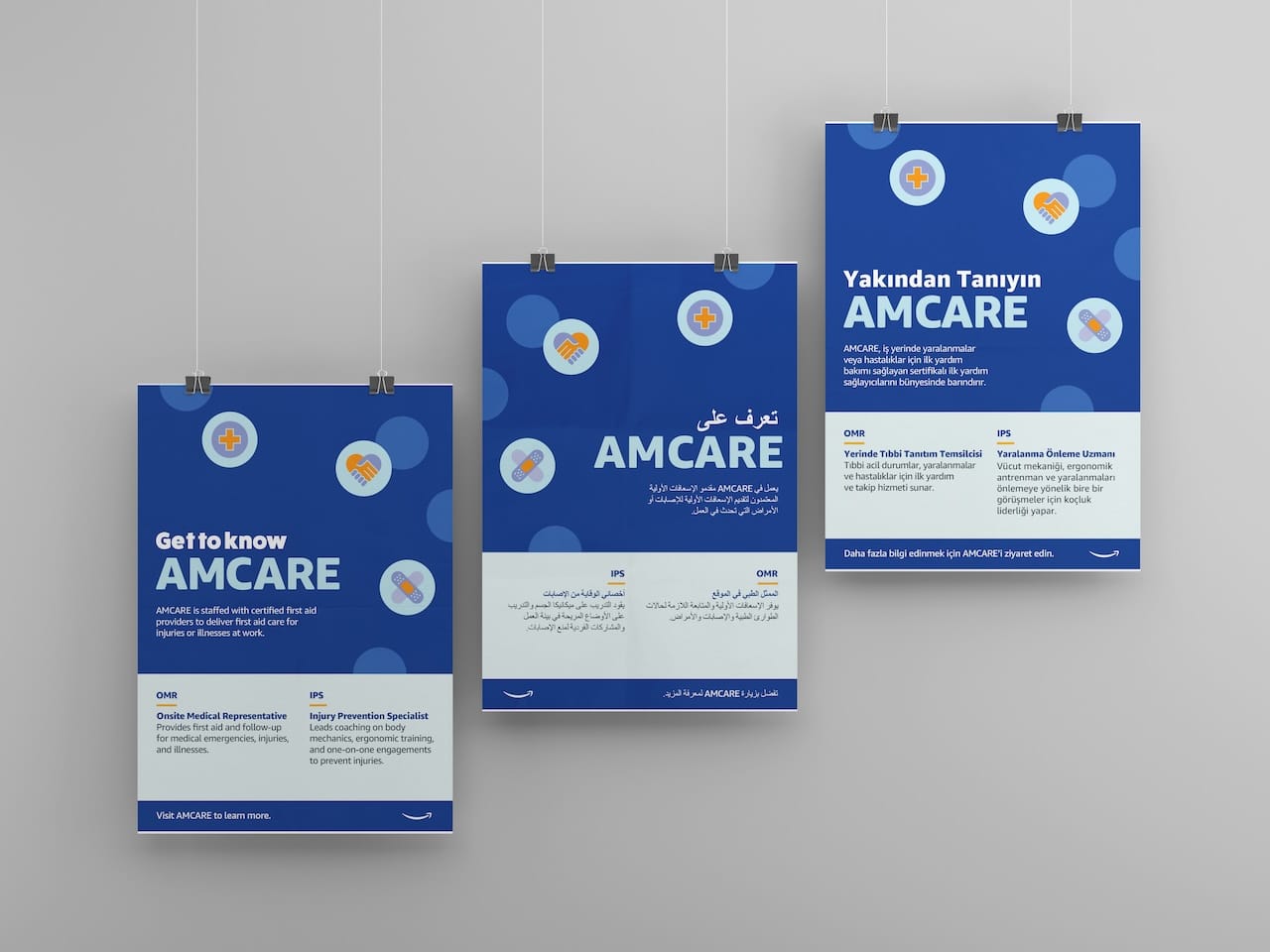
I led a collaborative effort across numerous teams to refresh the brand’s visual expression. The outdated mark was replaced by one which fit better into the evolving Amazon brand system. A new color palette added versatility to the wide variety of material types and use cases. In a working group, I coordinated the creation of new design templates to replace thousands of outdated assets, reducing one-off design requests by 90%, and ensuring brand cohesion.
Templates and Systems
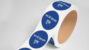
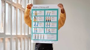
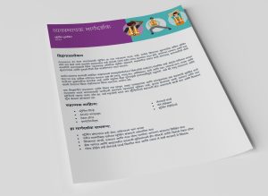
Instead of standard design templates, we created topic-based packages of templates and organize them into a digital asset management (DAM) system. Each package was professionally translated for a global reach, and available to stakeholder worldwide.
Impact
- Transformed a collection of 20,000 materials into a scalable library of cohesive designs
- Empowered non-designers to access brand-consistent materials and playbooks that met their needs, so they didn’t need to design their own materials
- Established a clear program identity, building trust with stakeholders, managers, and those the program served